Motion graphics alias TYPOGRAPHY WEEKS

(Malcom Garrett)
FINAL VIDEO
Typography
is important part of graphic design and one of the most difficult design field,
probably not these days but how many people can beautifully write?
I
suppose not that much because most of the people event didn’t think about the
typography that it is so complicated and it has so many rules. More than we
even think about?
Combination
of hand written papers combine with fonts is what I decided to do...

Immediate
after the first group session, first concrete poem what came up to my mind was
book called ANTIKODY written by Vaclav Havel (Czech president)
Especially,
I wanted to visualize one of his poems because of the impressive live he had
and it showed so much problems from communist but actually it is still actual
because of the new president. I could choose some different topic and create
and play just with font but it was not what I wanted.
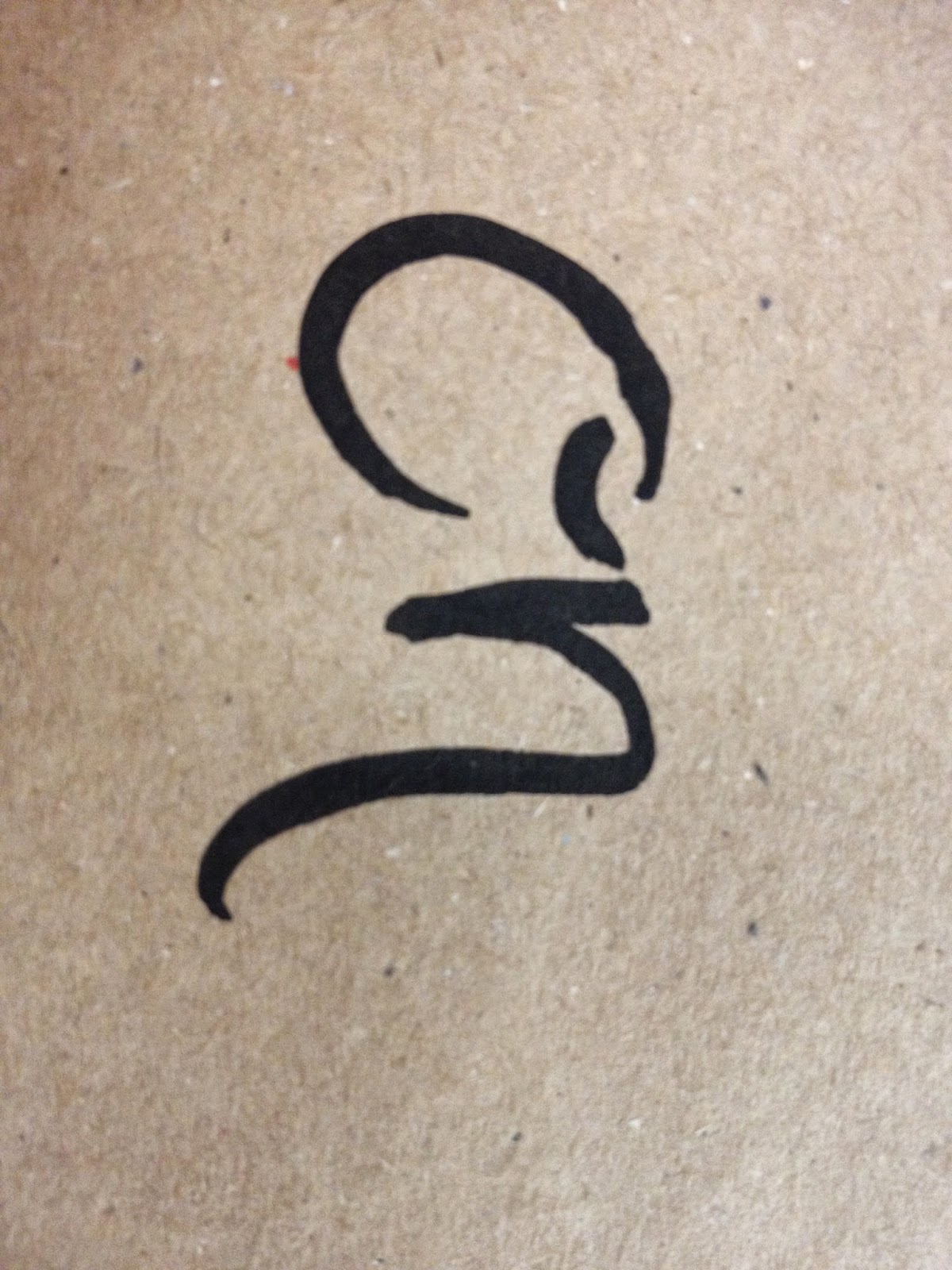
VZNIK A PRŮBĚH MANŽELSTVÍ
-------------------------
about mariage

on                       ona
on?                      ona...
on...                    ona??
  on                 ona
       on       ona
       on?      ona...
         on! ona?
         on! ona!
         O  N  I
         on?            ona...
   on...       ona?
         ona ona
         O  N  I
         O  N  I
         O  N  I
        O   N   I
       O    n    I
      O     n     I
     o      n      i
     on          ona
on!!!!!             ona!!!!!
 on!!!              ona!!!
       on       ona
       on       ona
       o   nnn    i
       o   nnn    i
       o   nnn    i
       o   nnn    i
*ona - she, on- he, oni - them
Combination
of sketchbook and my hands is representing the idea of changing mind, mood
during the period of know each other to the end...
I
though that it would be very easy to finish my idea but finally I figured out
that that it is much more difficult than I even expected because I had to
change the footage and re-do the whole animation. Playing with after affects is
much more difficult than to work with premiere pro especially because of the
layers effects and how the software slow down my computer...
To
be honest, I don’t think that simple animation is something for me event though
I like the visual and minimalist but I am not patience enough for complicated
animation, in addition I wanted to learn green screen stuff and playing with
illusion of past, present and future.
Even
though, I prefer minimalistic esthetic I am still not able to create some of
them, probably one day, Ill be, but in the same time I like expression and
illustration which is little bit thorn, colorful, playful.
In the beginning I was thinking go for the black and white as the simple one, but finally, I change it into the blur effects which should represent unexpected future as well the past which we forgetting all the time. The color hands between section representing present but also past and future. Hands where cant se anything its representation of future and how it is unpredictable..
I could choose different poem and I was choosing between ten poems but finally poem about relationship won because it is interesting and complicated.
Although,
it could seems as a cliché, there is a lot of interpretation and it is
fundamental
Behave
to share though with other, however; I do not feel
The
importance of the relationship...
After two weeks of intensive work on the project, probably I would like to change so much in after effects. I appreciated what I done so far, but maybe next time I would change the background and I would just play with the hands and the texts. Maybe its just because I was work too much on the idea instead of the technical side of the project, however; next time I go just for the hands and if I would have enough time I will change something.
I
learnt and explore so much effects and possibilities how to work with after
effects and premiere pro and effectively combine them and export and import.

To think


.png)

Reseach
1923PIET ZWART
Though he was formally trained as an architect, Piet Zwart is mainly known for his graphic design work. At the age of 36 Zwart produced his first typographic work when asked to design stationery for Wils’ office. This work clearly echoed the title lettering for the De Stijl periodical.
| |
This is no surprise, as during this period he met his close neighbour Vilmos Huszàr who co-founded the De Stijl magazine and designed the cover for the first issue. Together they would exchange thoughts and engage in several projects. He initially felt strongly attracted to the radical ideas of Theo van Doesburg and De Stijl, which propagated an abstract utopian world. But he did not wish to surrender entirely to the dogmatic ideas of De Stijl. His work was too playful to be restricted by dogmatism.
Zwart was also drawn to dadaïsm and the international avant-garde, particularly Russian Constructivism.
(http://www.iconofgraphics.com/piet-zwart/)
    |
1955 -Josef Müller-Brockmann (1914 - 1996)
Josef Müller-Brockmann was born in Rapperswil, Switzerland in 1914 and studied architecture, design and history of art at the University of Zurich and at the city’s Kunstgewerbeschule.
He began his career as an apprentice to the designer and advertising consultant Walter Diggelman before, in 1936, establishing his own Zurich studio specialising in graphics, exhibition design and photography. By the 1950s he was established as the leading practitioner and theorist of Swiss Style, which sought a universal graphic expression through a grid-based design purged of extraneous illustration and subjective feeling. His “Musica viva” poster series for the Zurich Tonhalle drew on the language of Constructivism to create a visual correlative to the structural harmonies of the music. Müller-Brockmann was founder from and, from 1958 to 1965, co-editor of the trilingual journal Neue Grafik (New Graphic Design) which spread the principles of Swiss Design internationally. He was professor of graphic design at the Kunstgewerbeschule, Zurich from 1957 to 1960, and guest lecturer at the University of Osaka from 1961 and the Hochschule fur Gestaltung, Ulm from 1963. From 1967 he was European design consultant for IBM. He is the author of The Graphic Artist and his Design Problems (1961), History of Visual Communication(1971), History of the Poster (with Shizuko Müller-Yoshikawa, 1971) andGrid Systems in Graphic Design (1981). He has contributed to many symposiums and has held one-man exhibitions in Zurich, Bern, Hamburg, Munich, Stuttgart, Berlin, Paris, New York, Chicago, Tokyo, Osaka, Caracas and Zagreb. In 1987 he was awarded a gold medal for his cultural contribution by the State of Zurich.
Yvonne Schwemer-Scheddin: You are the protagonist of the Swiss School and stand for objective, radically minimalist geometric design. You invented the grid system for graphic design and were the first systematically to outline the history of visual communication. For Le Corbusier, order was the key to life. Georges Braque said, “I love the law that orders the creative.” For Berthold Brecht, order covered up a deficit. What does order mean to you?
Josef Müller-Brockmann: Order was always wishful thinking for me. For 60 years I have produced disorder in files, correspondence and books. In my work, however, I have always aspired to a distinct arrangement of typographic and pictorial elements, the clear identification of priorities. The formal organisation of the surface by means of the grid, a knowledge of the rules that govern legibility (line length, word and letter spacing and so on) and the meaningful use of colour are among the tools a designer must master in order to complete his or her task in a rational and economic matter. (http://www.eyemagazine.com/feature/article/reputations-josef-muller-brockmann)


1956WILLEM SANDSBERGEXPERIMENTAL TYPOGRAPHICA
Torn paper shapes, layering of information, images wholly or partially submerged behind what appears to be a screen of tracing paper, a catalogue that doesn’t reveal the name of its subject matter until page eight. For some observers these may appear to be the stylistic hallmarks of our age, but many will recognise he distinctive signature of an earlier figure, the Dutch designer Willem Sandberg. This is the man who introduced contemporary art to post-war Holland and who, as director of the Stedelijk Museum in Amsterdam, laid the foundations for one of the best collections of modern art in Europe. The seminal graphic designer and the inspired museum director meet in a body of work that is a monument of Dutch graphic design.


ZUZANA LICKO
Zuzana Licko is the co-founder of Emigre, together with her husband Rudy VanderLans.
Licko was born in 1961 in Bratislava, Czechoslovakia and emigrated to the U.S. in 1968. She graduated with a degree in Graphic Communications from the University of California at Berkeley in 1984.
Emigre Magazine was founded in 1984 and garnered much critical acclaim when it began to incorporate Licko's digital typeface designs created with the first generation of the Macintosh computer. This exposure of her typefaces in Emigre magazine led to the manufacture of Emigre Fonts, which Emigre now distributes as software, worldwide.
(http://www.emigre.com/Bios.php?d=10)


LAURENT PINEBEL


HELMO
promenade


Lynch student

Nabokov
john call

VIDEOS
The Rolling Stones -- Doom And Gloom (Lyric Video)
FROM PAPER TO SCREEN from Thibault de Fournas on Vimeo
ANATOMY OF TYPOGRAPHY


All materials are from


